
The time has come to say goodbye to this project and bring on a new one. I ended up with a twenty page zine with three variant covers. Here they are:


I initially wanted to do something really simple, to emphasis postmodernism's lack of distinction between high and low art. Then I moved on to letters:

...And shapes:

I wanted to convey a sense of fragmentation and meaninglessness, but the result was rather trite and I decided to move on. I wondered if I could use handwriting as a visual symbol without drawing meaning from the words themselves.


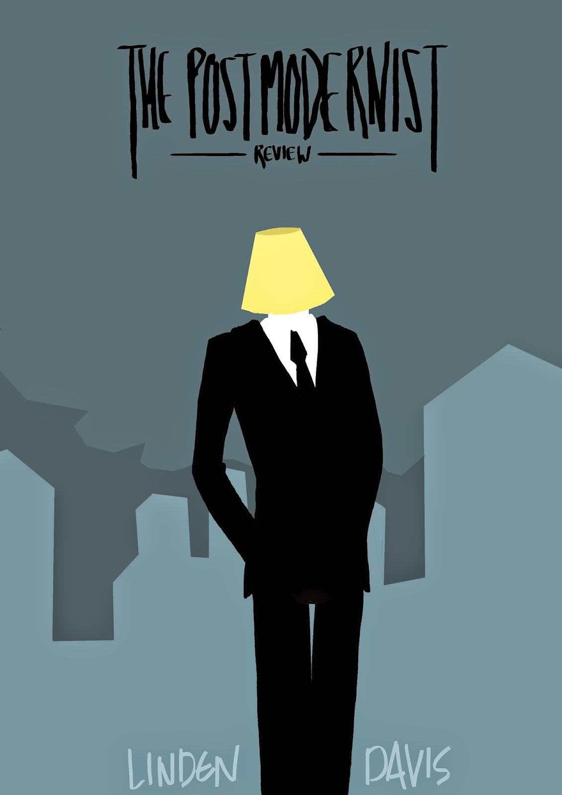
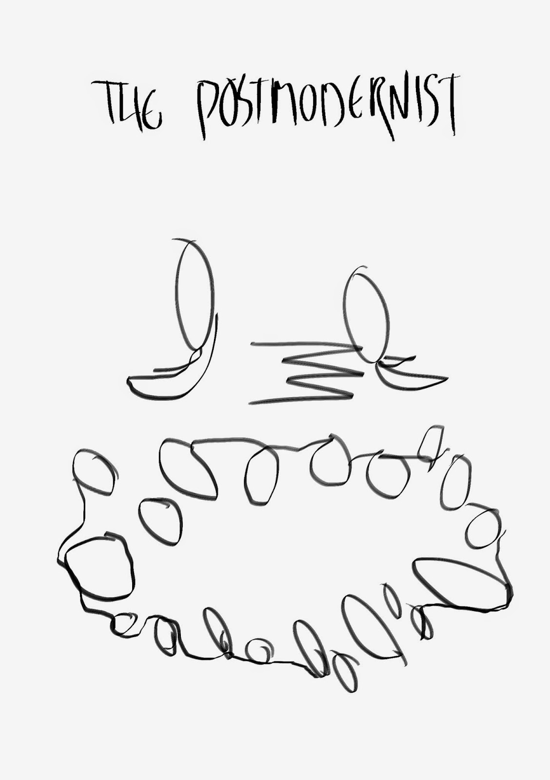
It's pretty clear that this is the basis of one of the final designs. The handwriting isn't as polished at this point, and in the end I abandoned the book icon, but the evidence is unmistakable. I also settled on a logo and title. This the development of the back cover for the same design:


I actually really like how it turned out, and I'm glad I took it further for one of the final covers.

I made this image at the last minute just to add context to the lampshade motif. The type is awful and makes me feel sad.

This is an "about the artist" page I decided not to add because I couldn't get the image to look decent. I'm also not sure if I stole the "he owns at least three proper books" line from somewhere. Finally, here are two experiments I liked enough to add to the zine:


All in all, I'm happy with the result of this project. Aside from gaining more of an insight into the subject matter given to me - which I find fascinating anyway - it gave me the chance to hone in on my digital abilities and learn some new methods I wasn't familiar with. It also taught me how information can inform the approach of an illustrator.
Next up: The Hopeless Living!